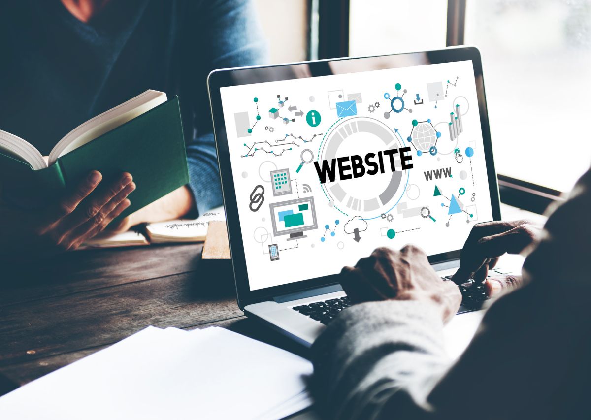
If you have ever clicked a button on a website, filled out a form, or tapped a mobile menu, you have used a UI. UI stands for user interface and describes every visual and interactive element that lets a person use a website, app, or digital product.
For moving companies, UI is not just a design term. It is often the difference between a visitor who gets a quote and one who bounces after a few seconds. When your user interface is clear, simple, and trustworthy, people feel confident booking a move with you instead of the competitor down the street. This is exactly why companies like Moving Engine focus so heavily on UI as part of mover-specific digital marketing.
At its core, a user interface is the layer where humans and technology meet. On a website, that includes your navigation bar, buttons, forms, price estimator fields, live chat icons, typography, colors, and layout structure. Every part a visitor can see, click, or tap belongs to your UI.
Good UI design focuses on making that interaction intuitive and efficient. The goal is to help users complete tasks like getting a quote, calling your office, or checking service areas with as little confusion as possible. When someone lands on your site, the interface should quietly guide them to the next right action.
UI and UX are closely related but not identical. UI is the visual and interactive layer: buttons, forms, menus, and imagery. UX, or user experience, covers the overall journey across pages, from first click on Google to confirmation email after booking.
Think of UI as the steering wheel, pedals, and dashboard of a truck, while UX is the entire driving experience from pickup to delivery. You need both to feel smooth. Even if your services are outstanding, clunky UI can make the digital part of that journey frustrating enough to lose leads.
Most moving customers are stressed, short on time, and comparing multiple companies. That mindset makes them very sensitive to how simple or confusing your website feels. A clear, friendly interface builds trust quickly and helps your brand stand out in a crowded market.
If 5,400 people visit your site each month but your forms are hard to use or your buttons are buried, you are leaving booked moves on the table. Strong UI reduces friction at every step so more visitors turn into calls, quote requests, and scheduled jobs. It also supports stronger organic performance, since good UI improves engagement signals that directly affect SEO for moving companies.
Great user interfaces are built from a few repeatable building blocks. When movers get these right, their websites feel easier, faster, and more trustworthy without needing fancy animations or complicated visuals.
Key UI elements include navigation menus, buttons and calls to action, forms, typography and color choices, spacing, icons, and feedback elements like error messages or success confirmations. Each part should help visitors quickly understand where to click and what happens next.
Your main menu is often the first UI element visitors use. For movers, navigation should highlight core services like local moves, long distance, packing, and commercial moves, plus obvious links to pricing or quote request pages. Clear labels beat clever wording because people scan, not study.
Good UI keeps navigation consistent across desktop and mobile. On phones, a simple hamburger icon that opens a well organized menu helps users jump straight to the section they need. Confusing menus cause visitors to back out and choose a competitor whose site feels easier to use.
Buttons are the workhorses of your UI. They tell people what to do next, like get a moving estimate, call the office, or check service areas. Strong UI design uses clear labels such as Get My Estimate or Call To Talk With Our Team instead of vague text like Submit.
Color and size also matter. Primary buttons should stand out from the rest of the page without feeling loud or aggressive. They need enough contrast so they are easy to see, especially on mobile screens, and enough padding so fingers can tap them comfortably without hitting the wrong element.
For many moving companies, online forms are the main lead source. That means form UI deserves extra attention. Each field, label, and drop down should be easy to understand and quick to complete. Lengthy, confusing forms are one of the biggest conversion killers on moving sites.
A clean form UI groups related fields together and uses clear labels like Move Date, Starting Address, and Number Of Bedrooms. Optional fields should be marked clearly, and progress indicators help for multi step forms. Real time validation messages gently show errors so users can fix them without starting over.
Most people researching movers are on their phones, often during work breaks or between errands. That means your UI has to adapt flawlessly to smaller screens. Responsive design ensures menus, buttons, and text all resize and reposition so everything stays readable and tappable on any device.
Key mobile UI details include large tap targets for buttons, simple vertical layouts, and forms that work well with thumb typing. Avoid clutter and force visitors to scroll rather than pinch and zoom. If your mobile UI is frustrating, many users will give up before they ever see your pricing or reviews.
Many moving company owners care deeply about customer service but overlook how digital design affects first impressions. A few recurring UI issues quietly drain conversions even when traffic numbers look solid.
Cluttered layouts, too many competing colors, and walls of text are frequent problems. Confusing menus, generic stock photos that all look alike, and quote forms that are hard to complete on mobile also push visitors away. The end result is fewer calls and fewer booked jobs than your marketing deserves.
You do not have to rebuild your entire website to get better UI. Start with small, focused changes based on how real users are interacting with your pages. Even modest improvements can have a measurable impact on how many visitors turn into leads.
First, review analytics to see which pages people land on most and where they drop off. Then walk through those pages as if you are a first time visitor. Notice where you hesitate, get confused, or struggle on mobile. Those friction points are the best candidates for immediate UI upgrades.
Every key page should have one main job. For a home page that might be getting visitors to request an estimate. For a services page, it might be helping them compare options. UI that tries to push several competing actions at once usually ends up diluting all of them.
Choose a primary call to action and design around it. Make that button the most visually prominent element, repeat it where it makes sense, and remove extra distractions. Supporting links can still exist, but your UI should gently guide users toward the outcome that matters most for your business.
UI is not only about shapes and colors. The words you use and how you arrange content strongly influence what users notice first. Clear headings, short paragraphs, and key benefits near calls to action help visitors quickly understand why they should choose your moving company.
Visual hierarchy uses size, spacing, and contrast to show which elements are most important. Bigger, bolder headings draw the eye, while consistent spacing between sections makes scanning easier. When your UI feels organized and calm, people are more willing to keep reading and take the next step.
The best UI choices are guided by actual behavior, not just opinions. Simple tests like changing button text, rearranging form fields, or adjusting mobile layouts can reveal what helps your audience the most. Over time these small improvements add up to a smoother, higher converting website.
Pay attention to metrics like time on page, form completion rate, and click through on key buttons. When you see positive movement after a change, keep it. If something hurts engagement, roll it back and try a different approach. UI is not a one time project but an ongoing part of your marketing engine.
Moving Engine focuses specifically on helping moving companies get found on Google, convert more leads, and grow with clear, data driven marketing. That includes making sure your website UI supports every campaign you run, from SEO to paid ads to local search.
Because our work is built for movers, we understand exactly what your visitors are looking for. We design and optimize interfaces so people can find your services, trust your brand, and take the next step without confusion. That way your marketing spend turns into booked jobs, not just clicks.
If your website feels dated, confusing, or hard to use on mobile, you are almost certainly losing leads you have already paid to attract. A focused UI tune up can unlock more calls and bookings without increasing your ad budget or adding new channels.
UI is especially critical when running high-intent campaigns like Google Local Service Ads where every click is valuable and your website must convert fast. A clean, focused interface ensures those paid leads turn into booked moves instead of wasted spend.
Moving Engine can review your current site, point out specific UI issues hurting conversions, and map out practical improvements that fit your budget and timeline. To start the conversation, email Pierce at Pierce@movingengine.io or call 912-461-5638 and share where your site is struggling most.
What is UI on a website?
UI, or user interface, is the layer visitors see and interact with on your website. It includes menus, buttons, forms, colors, fonts, and layout. Good UI makes it easy for people to understand your services and complete tasks like requesting a moving quote or calling your team.
How is UI different from UX?
UI covers the visual and interactive parts of your site, such as buttons, forms, and navigation. UX, or user experience, is the overall journey from first visit to final action. Strong UI supports good UX by making each step feel clear, predictable, and simple to complete.
Why should movers care about UI?
Moving customers are often stressed and short on time. If your UI is confusing or hard to use on mobile, they will quickly leave and choose a competitor. Clear, friendly UI builds trust, reduces friction, and turns more website visitors into real calls, quote requests, and booked moves.
What are signs my UI needs work?
Warning signs include high bounce rates, low form completion, cluttered layouts, hard to read text, or menus that are confusing on phones. If people frequently ask for help finding basic info like services or pricing, that also points to UI issues that are blocking conversions.
Can small UI changes really boost leads?
Yes. Improvements like clearer buttons, shorter forms, better mobile layouts, or simpler navigation often lift conversions without more traffic. When your UI removes friction and highlights next steps, more visitors reach the finish line, which means more booked moves from the same marketing budget.